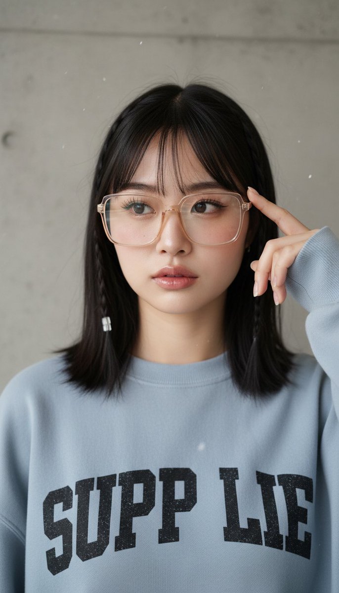
One-liner: Breaking down a studio portrait prompt with three replaceable slots, showing how it uses “fully written defaults” rather than “keyword placeholders” as a template — useful for anyone building their own portrait prompt templates who often gets tripped up by hands and printed text.
Field Table
| Field | Value |
|---|---|
| model | general (general-purpose image model; original library targets Nano Banana Pro, but the prompt itself is not bound to a specific model, based on the original repository’s positioning) |
| duration | Not applicable (static image) |
| aspect | 3:4 (vertical composition, explicitly stated as “vertical portrait” at the end of the prompt) |
| seed and reproducibility | Not recorded; not verified — the author has published final images, but this library has not re-run the prompt |
| Final image link | Embedded preview on the page, see card above and original post |
| Estimated cost | To be estimated (per official pricing, using the cost calculator) |
| Author and original link | YouMind-OpenLab · https://github.com/YouMind-OpenLab/awesome-nano-banana-pro-prompts |
prompt_zh
Original text reproduced (attribution + original link complete, see field table):
A close-up portrait of {argument name=“subject” default=“a young East Asian woman with fair skin, natural and soft makeup, a faint pink blush on her cheeks, defined eyelashes, and glossy light-pink lips”}. She has shoulder-length straight hair with soft bangs framing her forehead. On each side of her head is a thin braid, and one braid is decorated with a small transparent or white bead/barrette. She wears a pair of large rectangular transparent-frame glasses with a subtle warm beige or champagne tint.
Her right hand is raised near the right side of her face, with her index finger gently resting against her temple or beside the glasses frame, in a casual, thoughtful pose. She wears {argument name=“clothing” default=“a light blue-gray oversized crewneck sweatshirt with bold, distressed graphic lettering on the chest, with part of the text reading “SUPP LIE""}.
{argument name=“background” default=“The background is a finely textured solid neutral-gray concrete wall, with a few soft white particles floating in the air”}. Soft, even studio lighting with delicate highlights on the face and hair, shallow depth of field, highly detailed skin texture, photorealistic style, vertical portrait composition. License and attribution: From the YouMind-OpenLab open-source prompt library, repository README marked CC BY 4.0 (GitHub API returns NOASSERTION); author and original link retained per attribution requirements; actual license per the repository’s LICENSE file.
Breakdown
The 4 Things It Gets Right
1. Slots contain full paragraphs, not keyword placeholders — The default values for the subject / clothing / background slots are complete descriptions that can produce an image directly, not blanks like “a woman” or “a top.” Parameterized templates have two orientations: one minimizes the slots and relies on the user to fill them in; this one goes the other way — defaults are fully written, work as-is without modification, and when you want to change something, you replace the whole block. The benefit is zero-cost onboarding, and replacements won’t break sentence grammar or semantics by swapping only half a phrase. The cost is coarser slot granularity — changing just a hair color means rewriting the whole block. Which to choose depends on who the template is for: for your own iterative use, finer granularity is more convenient; for others to copy in one go, fully written defaults are less error-prone.
2. Detail anchors are dense and don’t conflict — Thin braids, a transparent or white bead/barrette at the braid tip, and large rectangular transparent-frame glasses: three small objects occupy three separate regions — the sides of the head, the braid tip, and the face — without competing for the same visual space or occluding one another. Anchors pull a generic “girl with glasses” toward a specific person. What’s especially worth learning is the color-temperature qualifier on the frames (“subtle warm beige or champagne tint”) — better than just “transparent frames” for avoiding a cheap plastic look. Qualifiers added to the objects models most likely to gloss over give the best return on investment.
3. The hand action has a landing point, not just a pose — “Her right hand is raised near the right side of her face, with her index finger gently resting against her temple or beside the glasses frame.” Hands are the worst failure zone for generative models — the more splayed and unsupported the fingers, the higher the chance of deformities. Having the index finger rest on a fixed fulcrum bundles the hand into a compact shape and gives it a reference point, drastically limiting the model’s room to improvise. What’s cleverer is that this action in turn supports the later phrase “casual, thoughtful pose” — action and emotion explain each other, so the model doesn’t have to guess what body language matches that expression.
4. The closing splits lighting, depth of field, and composition into three independent statements — “Soft, even studio lighting,” “shallow depth of field,” and “vertical portrait composition” each stand as short clauses placed after the subject description, not mixed into the character details. This structure of “subject paragraph first, photography parameters after” is solid: parameters don’t compete with details for weight, and the whole parameter block can be transplanted verbatim onto other subjects. See also The Three Elements of Depth of Field and Writing Light and Atmosphere Descriptions.
Where It Could Improve
1. Putting printed text in the default value plants a landmine in the template — “SUPP LIE” on the clothing is one of the least stable targets for image models: missing strokes, misalignment, duplication, misspelling — and the “distressed” texture makes it worse. The original already hedges (writing “with part of the text reading”), but a safer approach is to downgrade it entirely — write “black distressed graphic print on the chest, text blurred / partially obscured by folds” — or simply move the text out of the default and let those who need it add it themselves. Default values in templates get copied verbatim countless times; putting a high-failure-rate element in there replicates the failure rate along with it.
2. No negative list — The whole prompt says what it wants, never what it doesn’t. The high-risk items for this prompt are actually easy to enumerate: extra or fused fingers, lens reflections obscuring the eyes, braids merging into the bangs as one blob, background particles multiplying into noise. Adding a short AVOID section costs almost nothing — see Writing a Negative List (AVOID Section).
3. “Shallow depth of field” is qualitative only, with no quantity — Neither focal length nor aperture is given, leaving the degree of blur entirely to the model’s discretion; two runs of the same prompt could yield backgrounds where one is blurred beyond recognition as a wall and the other is nearly tack-sharp. For a close-up portrait, specifying concrete values like 85mm f/1.8 gives more control, and focal length also locks in perspective compression, which in turn keeps facial distortion in check — see The Visual Language of Focal Lengths.
Further Reading
- The Three Elements of Depth of Field
- The Visual Language of Focal Lengths
- Writing a Negative List (AVOID Section)